Color trends for 2026 in building products: what’s coming, why it’s coming, and how to win with it
January 7, 2025
.
Color in construction doesn’t move like fashion. It moves like concrete: slowly, deliberately, and then all at once when the market decides it’s done with whatever “safe” used to mean.
Heading into 2026, the signals are loud and consistent across major color authorities and coatings brands: buyers want calm, craft, and confidence. That doesn’t mean boring. It means intentional. Neutrals aren’t disappearing, they’re getting smarter. Dark colors are still relevant, but they’re becoming warmer and more touchable. Blues and greens are shifting from coastal-pretty to restorative and mineral. And commercial palettes are trying to balance nature, nostalgia, and technology in the same room without starting a fight. WGSN+3Sherwin-Williams+3Behr+3
Let’s break down the trends that matter for building product manufacturers and the commercial/residential construction ecosystem, with the real implications: SKUs, coatings, lead times, merchandising, spec, and marketing.
The macro forces shaping 2026 color
1) The “quiet luxury” hangover becomes “quiet function”
The design world has been on a minimalism kick for years. In 2026, it matures into something more practical: clean, livable, forgiving. That shows up in off-whites and warm midtone neutrals that aren’t sterile, plus layered palettes that feel composed rather than “picked from the sample rack in a panic.”
Pantone’s reported 2026 pick, Cloud Dancer (a soft off-white), is basically a permission slip: you can be neutral, as long as you’re not cold. ELLE
2) Nature-inspired doesn’t mean “sage everywhere”
Yes, there’s still biophilia. But the 2026 version is less eucalyptus spa and more geology: clay, khaki, mahogany, soot, mineral blue, deep teal. It’s nature with weight to it.
WGSN + Coloro’s Transformative Teal is a good marker here: it’s positioned as both “change and stability,” which is exactly what homeowners and facilities teams want when budgets feel tight and the world feels… enthusiastic. WGSN+1
3) Craft and texture are doing more of the work than chroma
When color risk goes down, texture goes up: matte and low-sheen finishes, visible grain, tonal variation, and depth through layering. You can see this explicitly in Benjamin Moore’s 2026 messaging around timeless classics, detail, and a palette designed to be layered. Benjamin Moore
For manufacturers, this is a coatings and materials story as much as a color story.
The 2026 palette, translated for building products
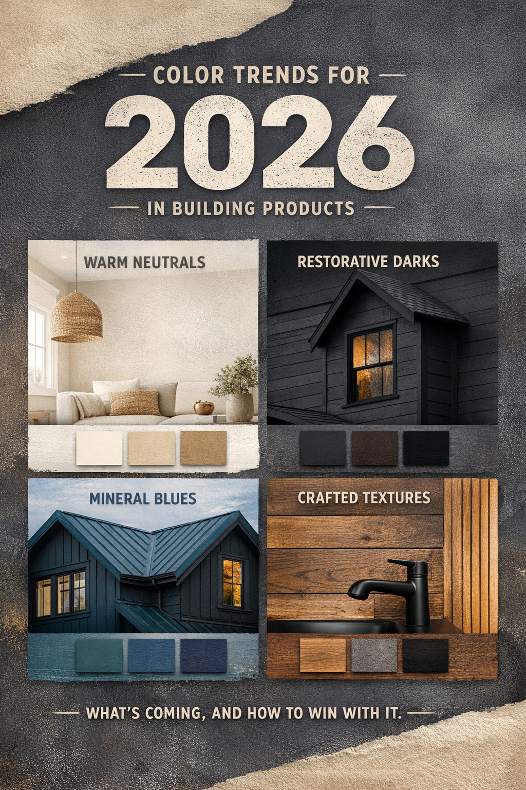
Trend A: Elevated off-whites and “friendly” light neutrals
What it is: off-whites, creamy whites, pale warm neutrals that feel breathable, not clinical.
Proof points: Pantone’s Cloud Dancer narrative (soft off-white), and HGTV Home by Sherwin-Williams listing light neutrals like Creamy and Neutral Ground in its 2026 collection. ELLE+1
Where it shows up in products
-
Interior wall systems, trim packages, cabinet lines
-
Commercial lobbies and education spaces where “bright” must still feel calm
-
Exterior body colors in warmer climates (heat + glare management)
Manufacturer implications
-
Don’t treat “white” as one SKU. Treat it as a family (warm, neutral, cool; matte vs satin; undertone control).
-
Merchandising needs undertone guidance. People don’t hate white. They hate buying the wrong white and living with it.
Trend B: Warm, grounded earth tones replacing stark gray
What it is: khaki, clay, umber, softened browns, and warm neutrals that play well with wood and stone.
Proof points: Sherwin-Williams named Universal Khaki as its 2026 Color of the Year, explicitly positioning it as timeless, nature-inspired warmth and layered elegance. Sherwin-Williams
PPG’s 2026 Color of the Year, Warm Mahogany, pushes the same direction: a grounded red-brown meant to be bold but timeless. PPG Paints
Where it shows up in products
-
Siding, cladding, fiber cement palettes
-
Metal roofing and accessory colors (especially when paired with warm woods)
-
Hospitality and retail exteriors seeking “inviting” over “imposing”
Manufacturer implications
-
This trend is a coatings capacity and inventory story: warm neutrals proliferate fast. Rationalize intelligently or you’ll drown in “nearly the same” SKUs.
-
Offer systems, not just colors: body + trim + accent + hardware recommendations that specifiers can copy-paste.
Trend C: Restorative darks (charcoal, soot, deep brown-black) with warmer undertones
What it is: dark exteriors and accents aren’t over. They’re just evolving away from cold, blue-black into warmer charcoals and brown-black hybrids.
Proof points: Benjamin Moore’s 2026 Color of the Year Silhouette AF-655 is described as a dark, burnt-umber-meets-charcoal vibe, anchoring a palette built for dimensional layering. Benjamin Moore+1
Where it shows up in products
-
Window and door finishes (aluminum, fiberglass, steel)
-
Metal panel systems and ACM
-
Exterior accents: fascia, gutters, lighting, hardware
Manufacturer implications
-
Heat management matters: darker colors increase surface temperature. If you sell exterior products, your spec sheets and warranties should address heat, fade resistance, and substrate performance in plain language.
-
This is where “premium finish” upsells live: matte textures, micro-texture powders, and higher-end coating systems.
Trend D: Teal-to-indigo blues that feel mineral, not nautical
What it is: blues shifting toward foggy, inky, and mineral. Less beach house, more “architect drew this with a serious pencil.”
Proof points: WGSN/Coloro’s Transformative Teal callout for 2026 is the headline. WGSN+1
On the architectural finishes side, Metal Architecture highlights indigo shades as 2026 trends for coil/extrusion finishes across architectural and residential applications. Metal Architecture
Where it shows up in products
-
Coil-coated metal roofing/siding
-
Entry doors and statement cladding panels
-
Hospitality interiors and feature walls
-
Healthcare/education areas that want calm without bland
Manufacturer implications
-
Blues are undertone landmines. Provide accurate photography, real-world installs, and sample programs that match field reality (lighting changes everything, and your customers know it).
-
If you sell configurable products, make sure your online visualizers don’t turn teal into turquoise. That’s how returns and rep damage happen.
Trend E: Commercial palettes balancing nature, nostalgia, and tech
What it is: commercial design trying to be human again without pretending technology doesn’t exist. Expect palettes that mix warm naturals, softened brights, and grounded darks.
Proof points: Behr’s 2026 Commercial Color Forecast centers on “elemental harmony,” explicitly balancing nature, nostalgia, and technology across a 50-color collection. Behr
Sherwin-Williams’ 2026 Colormix Forecast positions multiple families (tints, sunbaked hues, restorative darks) as forward-looking for design. Sherwin-Williams+1
Where it shows up in products
-
Workplace: warmer, softer environments (less “white box office”)
-
Retail: richer, moodier, more brand-defined
-
Multifamily amenities: hospitality cues everywhere
Manufacturer implications
-
Your commercial sales teams need palette narratives tied to performance: cleanability, durability, touch-up strategy, maintenance cycles.
-
“Color” is now a facilities decision as much as a designer decision. Speak both languages.
What building product manufacturers should do now for 2026
1) Build a 2026 color strategy by product line, not by mood board
A good palette on Pinterest can be a disaster in a product portfolio. Separate:
-
Hero colors (marketing magnets)
-
Core neutrals (volume drivers)
-
Architectural/spec colors (influence and margin)
-
Regional colors (climate + style-driven demand)
Then assign each a role: lead gen, conversion, spec retention, upsell.
2) Upgrade your finish storytelling
In 2026, finish is half the value:
-
Matte vs satin vs textured
-
Tonal variation and grain
-
Metal flake and pearlescence (used sparingly, like a good hot sauce)
Your marketing should show these in real installs, not only perfect renderings.
3) Make sampling and visualization brutally honest
If you sell color, your job is expectation management:
-
Better sample programs
-
Better “color in context” imagery
-
Better disclaimers that don’t read like legal panic
4) Equip your channel partners with systems, not swatches
Dealers, reps, and installers need:
-
Simple palette boards by style (Modern Warm, Crafted Dark, Mineral Blue/Teal)
-
Pairing recommendations (body/trim/accent/hardware)
-
Spec-ready PDFs and short training content
5) Watch the risk zones: fade, heat, and formulation changes
Dark exteriors, warm reds/browns, and certain blues can stress coatings. If you’re changing formulations for sustainability or supply reasons, test now and communicate clearly later. Otherwise, the internet will communicate for you. Loudly.
Where Draper DNA fits in
Here’s the thing: most manufacturers don’t lose on color because the palette was “wrong.” They lose because the go-to-market execution wasn’t engineered.
Draper DNA helps building product manufacturers turn color trends into revenue with:
-
Portfolio and SKU strategy (what to add, what to retire, what to regionalize)
-
Category and channel positioning (spec, dealer, retail, direct-to-builder)
-
Content systems that show color accurately in context (photography direction, installs, visualizers, spec tools)
-
Launch playbooks that connect product, finish, and lifestyle stories without getting precious about it
If 2026 is the year you refresh finishes, introduce a new palette, or simply make your color story less “here are chips” and more “here’s how to sell this,” we’ll help you do it with discipline and speed.
About Draper DNA
Draper DNA is a consultancy and marketing agency built for building product manufacturers who need strategy that survives contact with the real world: long sales cycles, channel complexity, spec influence, and products that have to perform as well as they photograph. We specialize in translating market signals like color, design, sustainability, and performance into clear positioning, smarter portfolios, and high-converting content systems that work across architect, builder, dealer, and homeowner audiences.
If you want, I can also add a 2026 “palette map” section with 4–6 named palettes (with hex values) tailored to exterior cladding, roofing, windows/doors, and interiors, so manufacturers can directly plug it into their product planning and launch decks.