There is a Difference featuring Kate Smith, color expert.
November 29, 2023
Meet color expert Kate Smith. She may the first person we have interviewed that has also interviewed with Oprah. Kate is widely respected for her knowledge and insights into the world of color, its importance, and impact on people, businesses, products, and more. We began working with Kate through our shared client DaVinci Roofscapes. Kate provides DaVinci and their customers with her expertise. We think you will be as impressed with her as we are. Enjoy!
I’m Kate Smith and I’m the chief color maven at Sensational Color, a consulting company I founded in 2001. And I became a color expert, not because I set out to do it, but my love of color led me to pursue a design degree. But still, even during my university studies, I found myself more interested in color and the interactions of color than many of the other aspects of design.
When I began a career in product development and marketing, I was fortunate to work for many or several, I shouldn’t say many, several top Fortune 500 companies. And as I worked my way through the executive ranks, I was basically tasked with color trends and capitalized on that opportunity by being able to work with some of the best in the industry. And I was fortunate that I had that chance because it really helped me take what I already knew and loved about color and hone it in the market for marketing and for product development.
When I opened my business, I thought I was going to do more general product development, but within the first year, it was clear to me that the skills that people wanted that I had all centered around color. And that’s really still what I do today, and I’ve been doing it for all this time, and I love it as much today as I did when I first started.
Why is color important to building products companies?
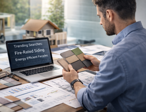
Color is so essential to any product, really any industry, but whether classic or contemporary, the materials and colors are what give a building its personality both inside and out. And today there’s so many fantastic colors available or really every part of the home that builders are using color from everything from the roof on down. And the color of a structure can make it memorable, unique, attractive. A commercial structure, the colors often communicate something about its purpose. And for a residential home or building, it sends a message about the people who live inside.
How can we use color to influence people?
Color influences everyone every day so much more than what most people even realize. In fact, there’s studies that show that often about 80 or more percent of our decision making in anything is somehow related to color, whether it’s in the food we choose to eat or what we purchase at a grocery store, there’s certain expectations we have of what the color should be.
It also draws our attention. It helps our memory. So, in a magazine or in an advertisement, sometimes color is used to really make a point stand out and helps cement it into our mind. Think of logos, I mean that’s part of your business. Logos to branding, design, all of those things are specifically geared towards influencing us. And it’s part of what makes to me colors so fun and so fascinating because it does have such a tremendous impact on our decision making.
How does color influence how you physically feel?
It’s really a great question to think about colors and their influence on us. The one that most people can relate most to is the color blue and how it helps us when it’s soft and quiet, a little bit more muted to calm us down. And it’s hard to explain sometimes why that works, but the thing that I’ve read that makes sense to me is that from all time humans when they were at a period of rest, let’s say from working, would either lay on the ground and look at the sky or sit by water, both elements that are blue, and there’s something about that that helps our body calm down.
Where red has the opposite effect, red actually makes us speed up our heart rate increase, maybe even make our palms a little sweaty, gets us a little excited. So, color can have a physical influence on us as well as kind of a psychological influence based on often more learned responses of what we relate to certain colors.
Tell us more about our favorite color, blue.
Blue certainly is a color that’s on trend right now, and part of it is that we want something to keep us feeling more calm and in the kind of fast hectic pace. Also, blue is related to nature. And if you think of how trends flowed from gray to green, so gray-green, and now into blue. People are seeking a little bit more color than always having everything neutral, and blue is a perfect transition. And so, both blue and green being colors of the earth also connect us to nature, which is a very calming influence for most people.
What is the most unusual or unexpected or surprising thing about colors?
The most surprising thing to me, and the thing that makes color endlessly fascinating is that its ability to change based on what surrounds it. So, the context of how we see a color or where we see a color, it can be the lighting, it can be the other colors around it, the color itself does not change, but our perception of the color changes to an incredible degree.
When I was in design school, we spent a lot of time doing basically exercises of where we juxtapose different colors to determine how they changed based on the color we put around it or beside it or what the lighting was. And so, to me, that’s the thing that makes it… I think surprises most people. They wouldn’t understand that when they move it into their home or they put a pillow on a certain couch, the color can change, or at least how we perceive it can change.
It’s why it’s hard sometimes for people to get the color exactly right. They know what they want in their mind, but to actually get it to show up in their home the way they envision isn’t quite as straightforward as they might expect. And so, to me, that’s the thing that surprises most people about color.
Are black and white colors?
Well, since black and white and gray are not part of the color seen on what we call the visual spectrum, which are often, if you think of it, the colors of the rainbow, I wouldn’t describe them as hues. So, hues are really the visual spectrum of what we see. If you remember Roy G. Biv, might have learned that in the school, but still the word color is a broader term. It’s broader than hue. It really defines all colors we see including black, white, and gray. So, when you ask me are they colors? Yeah, they’re colors. They’re just not hues.
Is white void of color and black the collection of all colors together?
I can tell you that actually just the opposite is true. Black is no color if you think of darkness, because all color is created by light. And so, when there’s no light, it’s black or some version of gray. And white light is all colors combined create the white. Most people think of… Probably the person that told you black was all colors is thinking more of pigment. There are many color systems which add to the confusion of color.
What is your favorite color and why?
My favorite from light, tranquil turquoise to deep, mysterious teal, any blue-green appeals to me. And why, I think my favorite color was written in the stars. I was born on the cusp of Aquarius, the water bearer and Pisces the fish. And so, it’s only natural that I love those watery hues.
Can life experiences connect you to a color?
That’s absolutely true. In fact, often your favorite color is something you’ve had since a kid, or even if it’s not still your absolute favorite, you like it. In the same, the opposite is true. So, if working with a customer, if you had, let’s say I worked with people that had a yellow bedroom as a kid, and even if yellow was a great color for some place in their home, they will never use it. They can’t stand the color and it never changes. You’re never going to convince them that that’s a great color no matter how well it fits into the design, because those associations that we make are so strong and especially the ones we make in childhood, they seem to last a lifetime.
What do colors say about a person or a business?
Oh, I think when you’re looking at how the colors… I always say it depends on whether the personality of the business is the person or is it the business. And in either case, based on that, you’re trying to capture the personality of the company in their colors so that when a person sees it, it speaks to them about something about the business. So, whether it’s purple and green, which doesn’t sound great, but it was a color that a friend of mine used for her logo that totally reflected her just the perfect color combination.
Or like your logo (Draper DNA). When I look at your logo, I definitely have an idea of what your business is. So, it has a very designed sort of the high contrast of black, white, and gray, that high contrast. But then you use blue, which is a color associated with business, but you used a shade that was more upbeat, modern, a bit more innovative, and I feel like, perfect. I mean, that to me says what your business is about. So, it has that trustworthy, design-y and innovative all rolled into one with the colors that you chose.
Can I tell you a secret?
Draper DNA uses the same color palette as the Carolina Panthers professional football team. It is our nod to being a North Carolina based business.
Can I tell you a secret too?
That when I was in my corporate career, I handled the NFL sidelines and team apparel, that was my division. And I did the Carolina Panthers first uniforms.
One of our clients, DaVinci Roofscapes, offers your color consultant services free to people who are considering purchasing their composite roofs. What type of difference have you seen this service make in the past decade of homeowners, both in the way they view DaVinci for supplying your services to them and in how they use your services to determine different colors in their home exteriors?
Well, now we’re touching on one of my favorite parts of what I do, which is helping homeowners and to even the people that help the homeowners to select their color. And the biggest difference when you talk about me being a color expert, there’s many people that are color experts, know a lot about color, help with color, choose product colors, but the thing that differentiates me or what I like to call my color superpower is enabling others to be able to make a decision about color.
I rarely tell someone what color to choose. What I do is I work with them, I understand what they have in mind, and I guide them through the process by telling them what to think about and what to look at as they choose their color. Because there’s really… People take a lot of pride in being able to make that decision, especially when it comes to their home.
I so enjoy, in fact, oh my gosh, you’re getting me a little teary-eyed. I get so emotional about it that when I think back about the comments, I received back from homeowners about how excited they are or how pleased they are or how much my guidance helped them to be able to choose something that they love for their home. And that is a tremendous reward. In fact, I keep a little email file called compliments and kind words. So, if I’m ever having a bad day, all I have to do is look at that and go, oh my God, people are so thrilled and so happy when they are able to choose a color they love.
And a roofing purchase is a big decision. I understand that. It’s tremendous. And anything on the exterior, if you can make a mistake on your inside who sees it, not as many people, but on your outside of your home, it’s open to the whole world to see. And so, I do understand being hesitant. We had a customer and his wife, and they had narrowed it down to some colors that would be great on their home. And Robert was not sure. They just weren’t sure of ready to pull the trigger.
And so, I walked them through looking at their home of what I would think about, what I would look at, and it just made them be able to make the decision to feel confident about it. And I also work with the sales team, and DaVinci Roofscapes has a fantastic sales team both inside and out. And I have to say they’re so appreciative. But I even got notes from the sales team. Stephen sent me a note that says, hey, you’re making me look really good with my customers. And in fact, this order closed, and they’ve already placed it this week.
And things like that are very rewarding to me. So, there’s many things I do with color, with helping customers, with helping companies, but I have to say the most rewarding is knowing that I’ve helped a customer come to a decision for their home that makes them really, really proud.
Do you have a 2024 color of the year?
Well, my color of the year is always blue green, but I will say I’m loving the new blues. And I think the thing that I always look for is colors that are a bit more sophisticated. So, I’m going to tell you another little secret about color. So, one of the things and why as a color trend forecaster, I say one of the best predictions I made was way back in the early 2000s of predicting that people were going to develop a much greater interest in color and a much more sophisticated view of color.
And what I mean by that is that liking more neutrals and sophisticated tones, so not just the everyday grays and beiges, but grays and other colors that combine multiple colors. And I like to call them, and I have for years called them the ish colors. So, if you find yourself describing a color as greenish-grayish or bluish-greenish-gray or brownish-beige, or… When you can’t quite pin a clear descriptor on the color, it’s because it’s a rather complex color.
And once people begin loving those more complex tones, they never go back. They always want a more sophisticated view of the colors that surround them. So, when I look at that and I look at the blues of this year, it’s not just the everyday blue, but it’s the tones of blue, especially the blue greens. But any kinds of blues that are a bit more complex and have a bit more intrigue to them when you’re looking at them.
We agreed that we could talk all day. The art and science of color is absolutely fascinating and important to you and your business. Thank you, Kate.
Watch our interview with Kate on the Draper DNA YouTube Channel by pressing play below.